Many restaurants still rely on phone calls to manage pickup orders — leading to frequent mistakes, long wait times, and overworked staff.
iOrderFoods was created to offer a digital solution, but early usability issues caused frustration for both customers and restaurant owners.
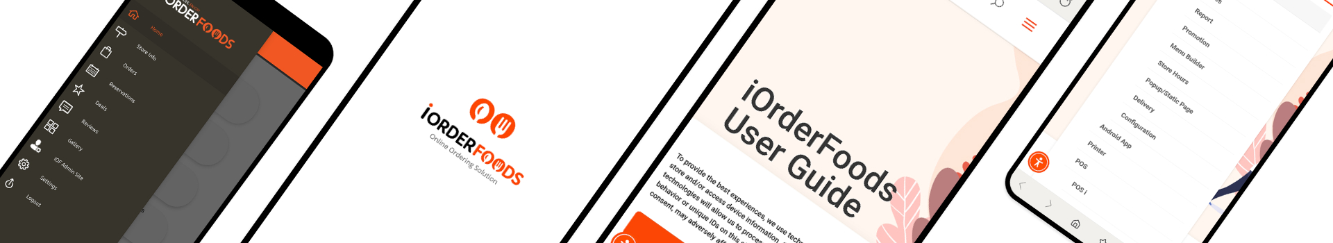
To address this, I redesigned core areas across the ordering platform and notification app —
including login, payment, menu clarity, real-time order alerts, and admin guidance — resulting in a more intuitive, self-serve experience.
Myself (UI/UX Designer, Title: Senior Web Coordinator)
1 Manager, Outsourced Developer Team
I coordinated between internal and external teams - working with an outsourced developer team via Slack and the internal manager
through Google Chat and email.
Designs were created in Figma and handed off through Visual Studio.
"I clicked ‘Order’ but couldn’t figure out where to log in."
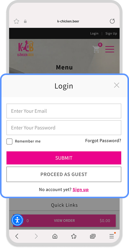
Problem: Users didn’t see a clear login entry point
Solution: Moved login screen to appear immediately after "Order" click
Result: Reduced hesitation and entry drop-off
"I thought I paid, but it didn’t go through…"
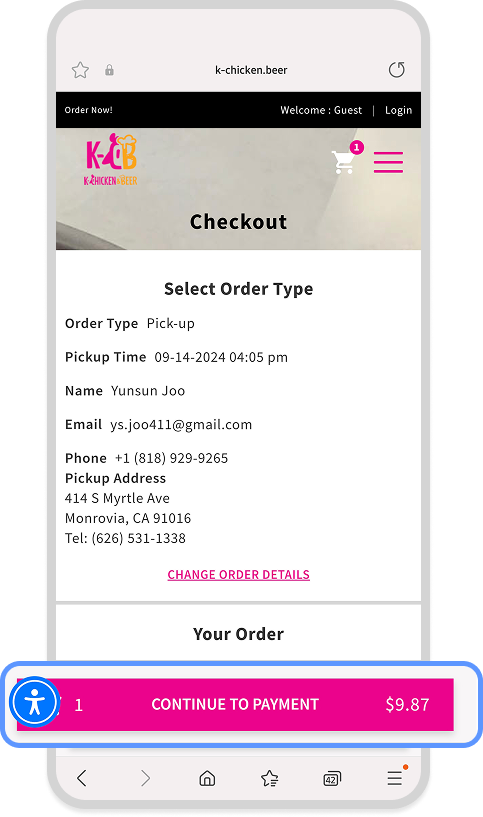
Problem: Users assumed checkout was complete before actual payment
Insight: Referenced Amazon’s bold CTA and GAP’s persistent checkout buttons
Solution: Made the “Pay” button more visible and sticky
Result: Checkout completion rates improved noticeably
"Is this spicy? Vegan? I can't tell."
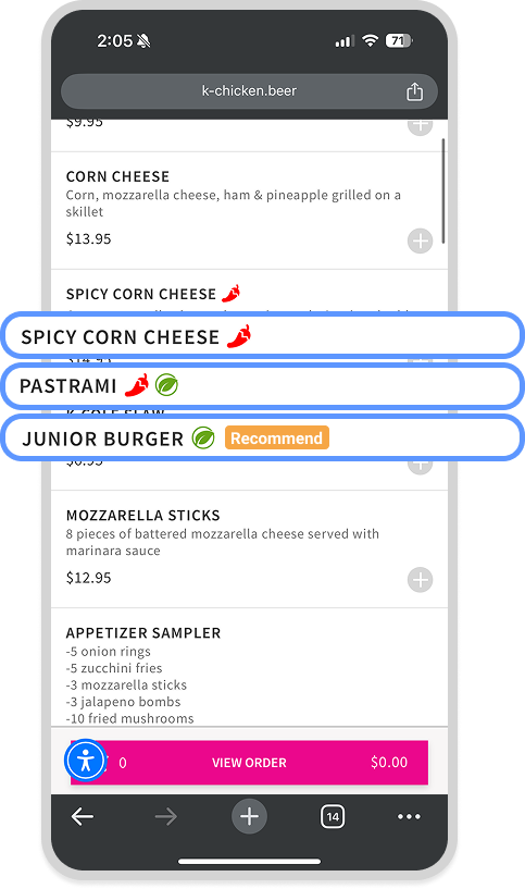
Problem: Dietary info and featured items were visually unclear
Solution: Added icons and color-coded tags to improve menu readability
"How do I add a menu item again?"
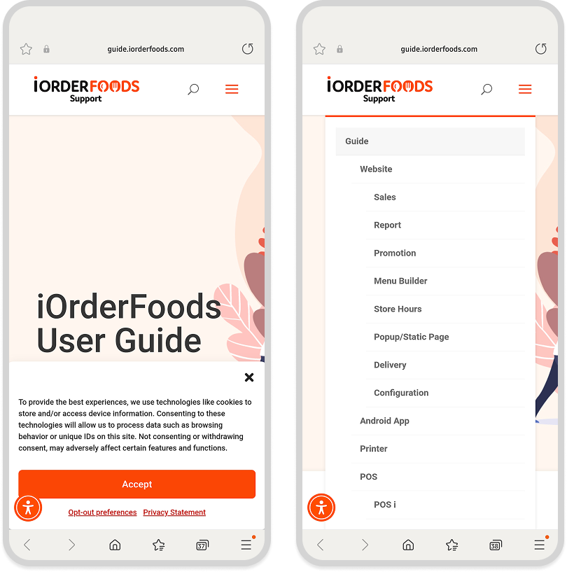
Problem: Frequent admin questions led to support overload
Solution: Created an embedded Help Center in the admin panel
Result: Support call volume dropped by ~90%
"How do I add a menu item again?"
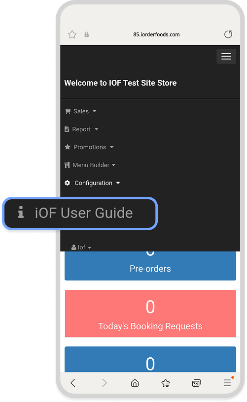
Problem: Even long-time admin users often forgot how to complete basic tasks and struggled to find the help link.
Insight: While using the Nordstrom app, I noticed that viewing detailed order information required switching to a browser
- breaking the flow.
Based on this friction, I proposed embedding a permanent help link directly into the admin menu.
I communicated the idea to the developer team, provided real-world examples, and collaborated closely with them to implement the feature effectively.
Solution: Developer implemented it directly
"We didn’t even notice a new order came in."
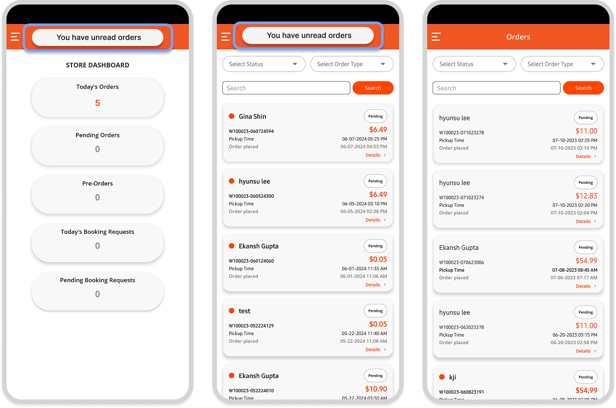
Problem: Unread orders weren’t visually distinct
Solution: Used bold text, red dots, and persistent alerts (inspired by iMessage)
Solution: Reduced missed tickets
"Can we change pickup time without going to the dashboard?"
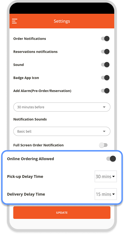
Problem: Staff couldn’t modify order settings in-app
Solution: Added toggles and sliders for quick in-app control
"I’m not sure where the real settings are — is this the admin page?"
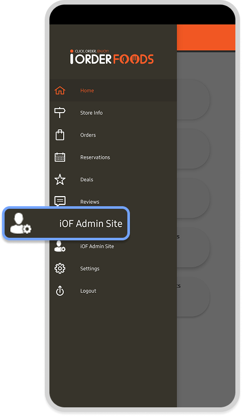
Problem: Users couldn’t easily find true admin settings
making it difficult to access key settings
Solution: Added direct shortcut in hamburger menu, revealing side panel
Result: Reduced confusion, faster admin access
✅ Support call volume reduced by ~90%
✅ Checkout abandonment significantly decreased
✅ Improved user clarity and staff confidence
✅ Reduced onboarding friction and training time
Figma / Illustrator / Visual Studio / Slack